
Security Desk's dynamic charts and graphs provide visual data that can be used to perform searches, investigate situations, and identify activity patterns.
Visual reports can display data in a graph or chart format along a specified axis by using lines or bars to visually represent the report data. The X axis represents all the labels (group by), and the Y axis shows the total number of instances relative to the X axis.
The following chart types are supported in Security Center when using the Generate report functions in Security Desk: Lines, Columns, Stacked columns, Rows, Stacked rows, Doughnut, and Pie.
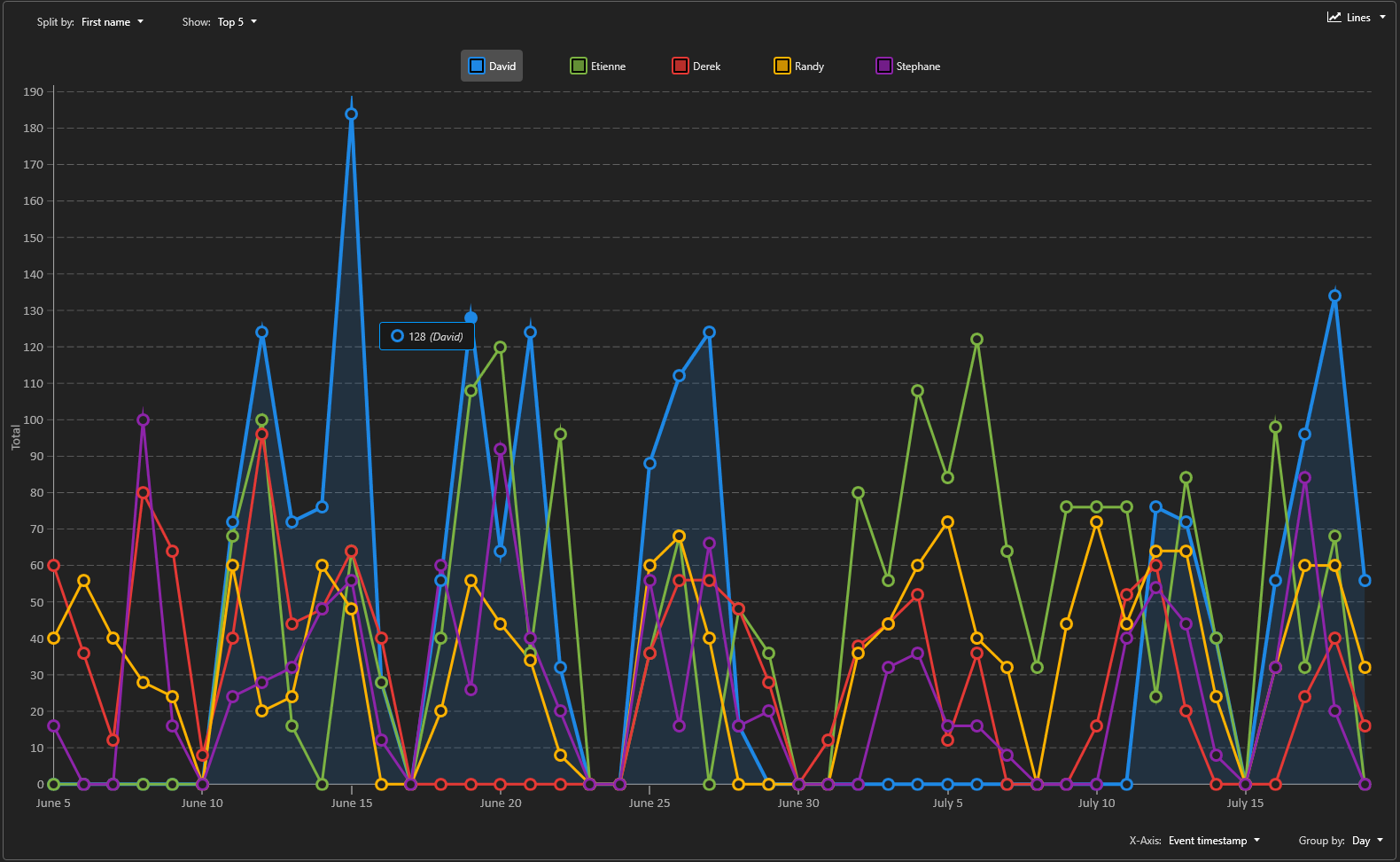
The following example shows a Cardholder events report, Split by: First name, Show: Top 5 and X-Axis: Event timestamp, Group by: Day as a Lines chart.
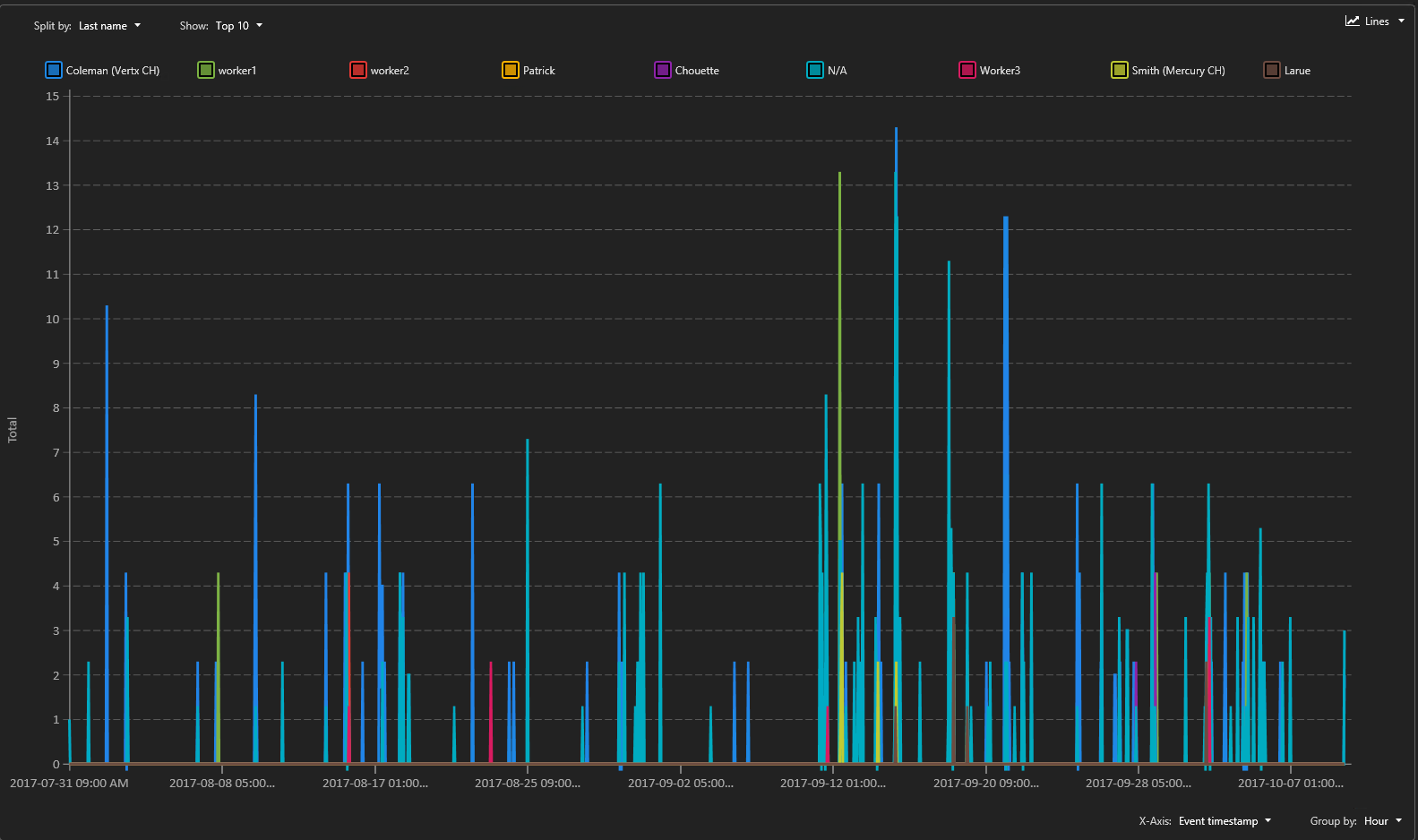
When the time range is too wide or too precise, a lot of data has to be computed and displayed on screen. In this situation, a simplified version of the lines chart is displayed.
The following example shows a simplified version of a Lines chart.
Use a Columns chart when you want to group the data by category and display the results using vertical bars.
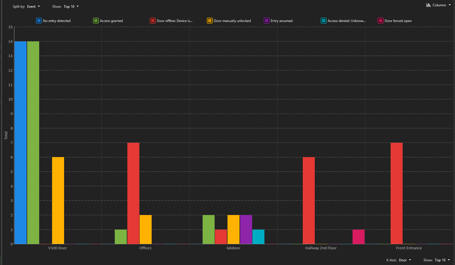
The following example shows a Door access report, Split by: Event, Show: Top 10 and X-Axis: Door, Show: Top 10 as a Columns chart.
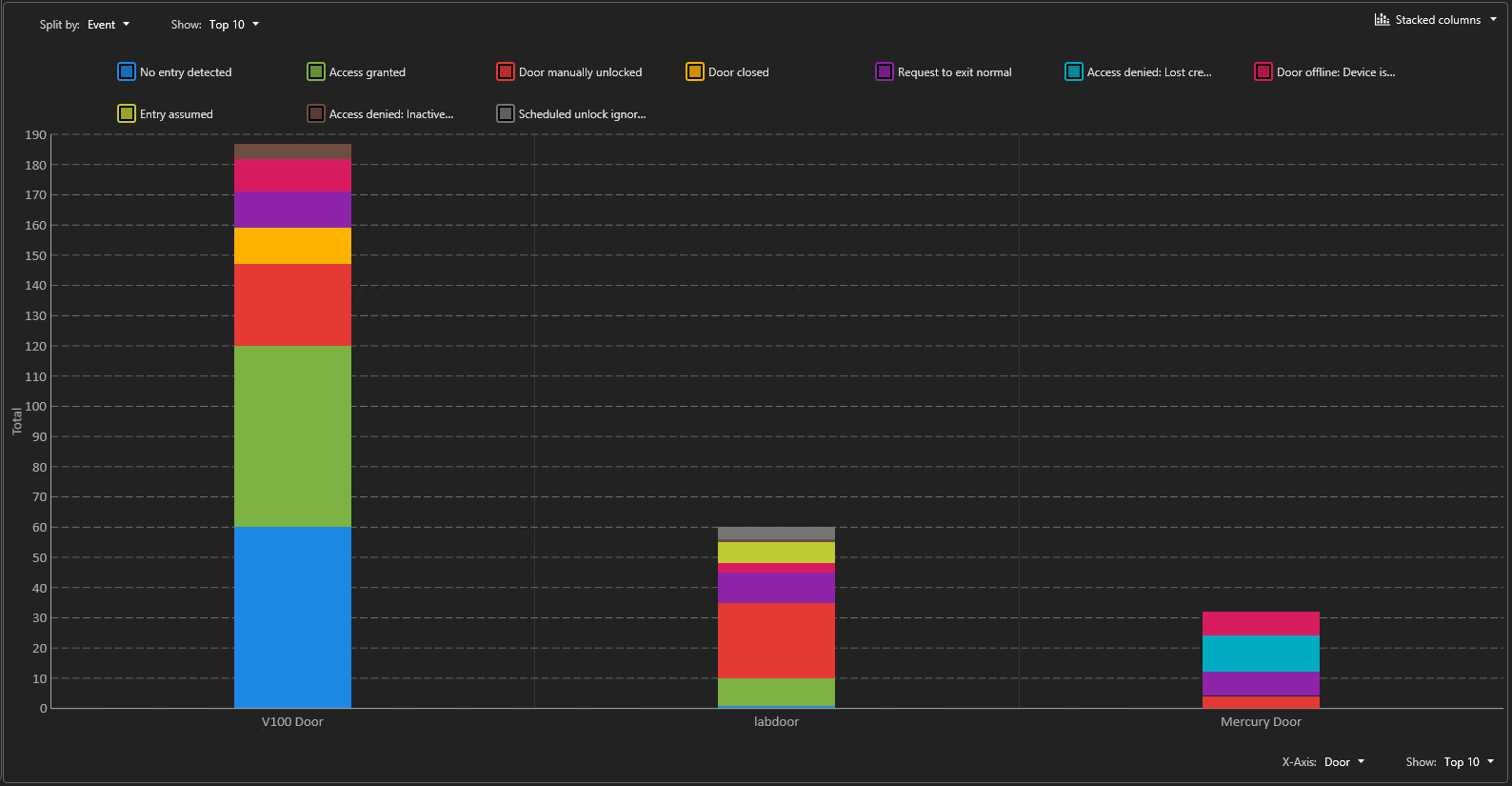
Use a Stacked columns chart when you want to group the data by category and display the results using vertical bars. The Y axis can be used to split the data and have more precise information in relation to the X value.
The following example shows a Door activities report, Split by: Event, Show: Top 10 and X-Axis: Door, Show: Top 10 as a Stacked columns chart.
Use a Rows chart when you want to group the data by category and display the results using horizontal bars.
The following example shows an Intrusion detector report, Y-Axis: Camera, Show: Top 10 and Split by: Frame time, Group by: Hour, Show: Top 10 as a Rows chart.
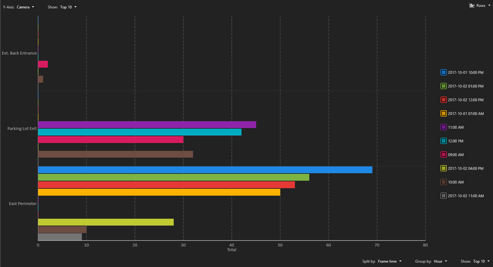
Use a Stacked rows chart when you want to group the data by category and display the results using horizontal bars. The X axis can be used to split the data and have more precise information in relation to the Y value.
The following example shows an Intrusion detector report, Y-Axis: Camera, Show: Top 10 and Split by: Frame time, Group by: Hour, Show: Top 10 as a Stacked rows chart.

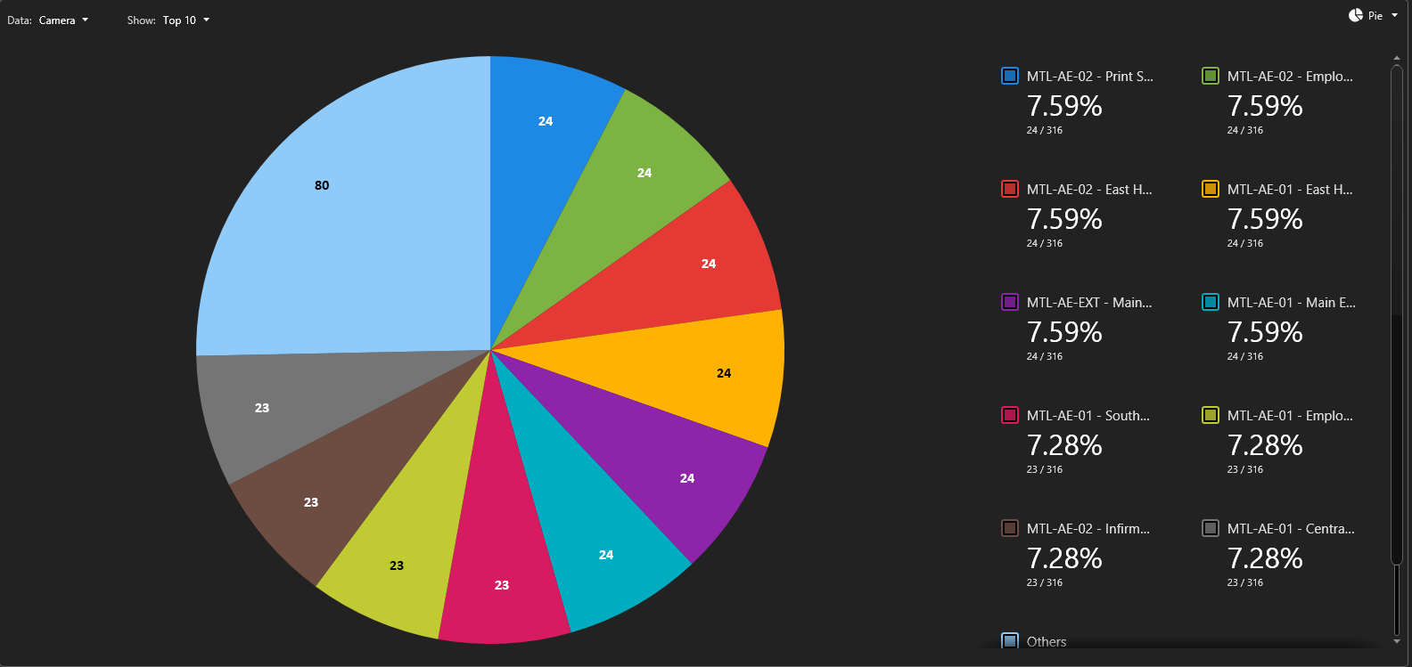
The following example shows a Camera events motion report, Data: Camera, Show: Top 10 as a Pie chart.
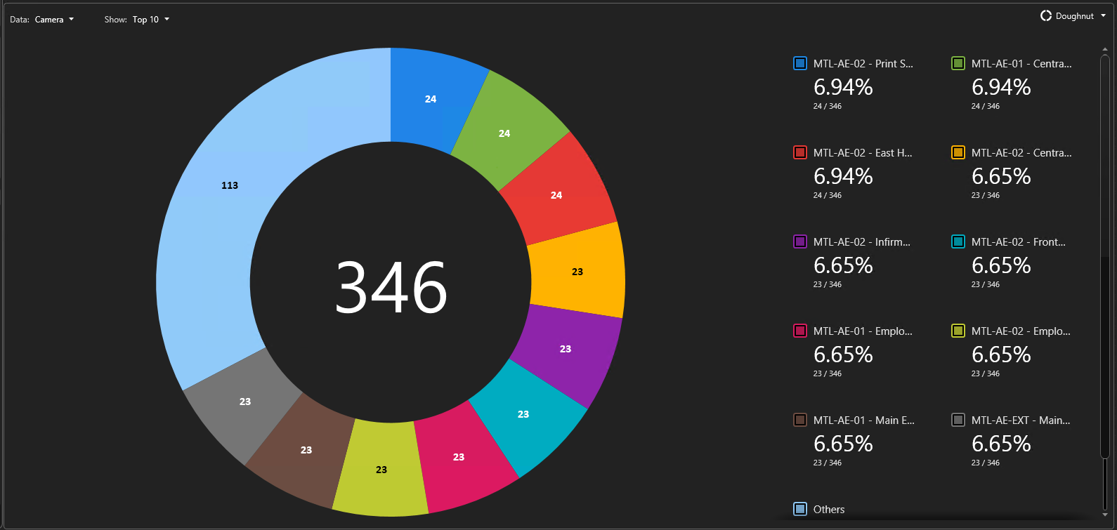
The following example shows a Camera events report, Data: Camera, Show: Top 10 as a Doughnut chart.
